Can someone explain this graph?
According_Pause_994
|
2026-03-18 10:37
|
1 views
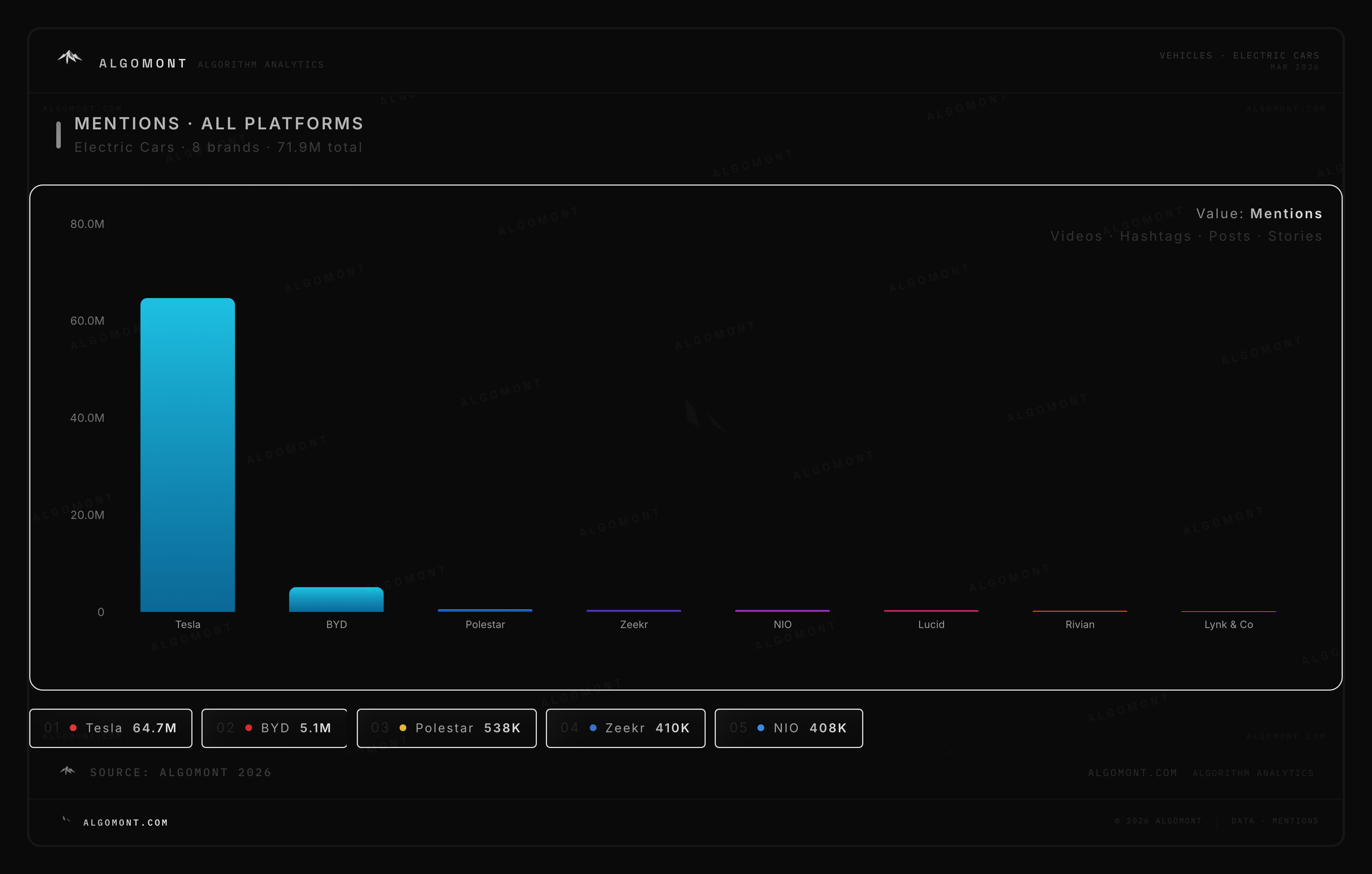

Probably some marketing trash tracking mentions by Elmo
It is a graph with blue boxes. A little context would be helpful.

Yes, everyone is presumably astounded on their socials how the company that made electric cars popular has self destructed and gone to build humanoid robots nobody needs. Mentions isn't exactly a metric that implies positivity.
https://preview.redd.it/d5lloxphespg1.jpeg?width=266&format=pjpg&auto=webp&s=9d9698201d160bf4c7c2324b92b8b18f6083a4c2

Yep looks like a Claude graph
Not that much to explain given the context. Presumably “Algomont” is some service that scrapes different social media to see what is being mentioned, and this is simply a graph of the number of times each EV brand in the image has been mentioned.
Login is required to comment.
Login with Google